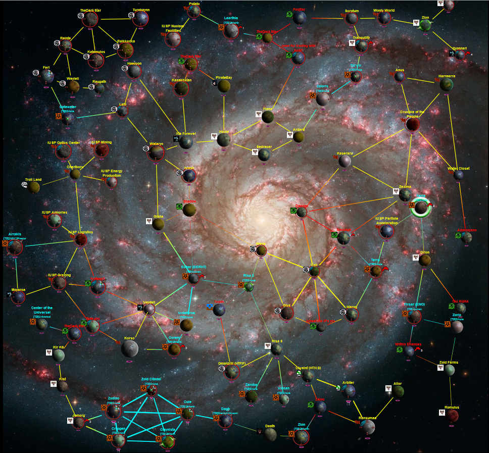
I went with colaColin idea of spiraled galaxy :
First one is a nice spiraled galaxy. The problem I see there is that the links will be ugly.
Second is the same, but skipping some planets in the pattern. It's worst.
Third is the more interesting I think, but you lose the spiral feeling.
I will try to make a interactive version so you can play with the parameters yourself.
This forum is archived and read only.
Please move to the new forum!
- It is currently 07 Apr 2021, 02:59
Forged Alliance Forever
Forged Alliance Forever Forums
Reshaping the galaxy.
32 posts
• Page 1 of 4 • 1, 2, 3, 4
Reshaping the galaxy.
Nossa wrote:I've never played GPG or even heard of FA until FAF started blowing up.
-

Ze_PilOt - Supreme Commander
- Posts: 8985
- Joined: 24 Aug 2011, 18:41
- Location: fafland
- Has liked: 18 times
- Been liked: 376 times
- FAF User Name: Ze_PilOt
Re: Reshaping the galaxy.
thats great! 
althought i'm not completly pleased with it yet..its too linear/too much symetry for my taste. an interactive version would be awesome!
I think it would be great if you have more or less random groups of planets together, that have few connection between each other, but many between the planets in the group.
example:
another:

-

Zock - Supreme Commander
- Posts: 1395
- Joined: 31 Aug 2011, 22:44
- Has liked: 173 times
- Been liked: 397 times
- FAF User Name: Zock
Re: Reshaping the galaxy.
OK so those images are freaking sweet! Love the look and idea of that sooooo much!!!
Quick Question though, its something Funk and i mentioned in the contributors forum. Is it at all possible to flip the map so it coincides from a role playing perspective?

Simply by inverting the positions it would look more like the actual map so Seraphim top left, UEF top right, Cybran bottom right and Aeon bot left?
Zep you did say something about this being difficult before??
G
Quick Question though, its something Funk and i mentioned in the contributors forum. Is it at all possible to flip the map so it coincides from a role playing perspective?

Simply by inverting the positions it would look more like the actual map so Seraphim top left, UEF top right, Cybran bottom right and Aeon bot left?
Zep you did say something about this being difficult before??
G
My youtube Channel:http://www.youtube.com/user/felixlighta?feature=mhee
"Don't take life too seriously... no one gets out alive."
"Don't take life too seriously... no one gets out alive."
-

Gyle - Avatar-of-War
- Posts: 261
- Joined: 05 Apr 2012, 00:35
- Location: UK
- Has liked: 52 times
- Been liked: 28 times
- FAF User Name: Gyle
Re: Reshaping the galaxy.
Flipping the position is easy, putting less arbitrary shape is a little more difficult.
Nossa wrote:I've never played GPG or even heard of FA until FAF started blowing up.
-

Ze_PilOt - Supreme Commander
- Posts: 8985
- Joined: 24 Aug 2011, 18:41
- Location: fafland
- Has liked: 18 times
- Been liked: 376 times
- FAF User Name: Ze_PilOt
Re: Reshaping the galaxy.
I think it's a good idea, and the last shape looks not too bad. Also, I believe that if the background looks like a galaxy of approximately the same shape, like in zock's pics, it'll look definitely better.
- pip
- Supreme Commander
- Posts: 1826
- Joined: 04 Oct 2011, 15:33
- Has liked: 191 times
- Been liked: 86 times
- FAF User Name: pip
Re: Reshaping the galaxy.
Ze_PilOt wrote:I went with colaColin idea of spiraled galaxy :
First one is a nice spiraled galaxy. The problem I see there is that the links will be ugly.
Second is the same, but skipping some planets in the pattern. It's worst.
Third is the more interesting I think, but you lose the spiral feeling.
I will try to make a interactive version so you can play with the parameters yourself.
This is TOTALLY AWSOME
Re: Reshaping the galaxy.
Love some zock idea and maybe i found something good looking and can make a good base for a galaxy.
http://www.scientificgamer.com/blog/wp- ... luster.jpg
I know the good looking part is not the biggest thing to do for now( i know that) and we can add few route too attack.
If you want zep, i could work on a galaxy and summit here. I just need how many planet you want (it will do a basic paint blue print)
in the worst case we could use estetic part
-

Circuit 
- Posts: 86
- Joined: 06 May 2013, 18:20
- Has liked: 0 time
- Been liked: 1 time
- FAF User Name: Circuit
Re: Reshaping the galaxy.
While it's looking good like that, it won't be very interesting gameplay wise because the links are drawing a single path to each cluster (like my first screenshot).
Nossa wrote:I've never played GPG or even heard of FA until FAF started blowing up.
-

Ze_PilOt - Supreme Commander
- Posts: 8985
- Joined: 24 Aug 2011, 18:41
- Location: fafland
- Has liked: 18 times
- Been liked: 376 times
- FAF User Name: Ze_PilOt
Re: Reshaping the galaxy.
Is it just me or has somebody else problems to distinguish aeon and seraphim territory? Maybe Aeon could be a bit more greener 
Greetz Hascins
DoubleGunCasts https://www.youtube.com/channel/UCwocDhiHCqCAjJo1-HFk-TQ
My Channel https://www.youtube.com/channel/UCmcoJlMJaVQpGmETPZzCTNw/videos
DoubleGunCasts https://www.youtube.com/channel/UCwocDhiHCqCAjJo1-HFk-TQ
My Channel https://www.youtube.com/channel/UCmcoJlMJaVQpGmETPZzCTNw/videos
-

Hascins 
- Posts: 400
- Joined: 28 Dec 2012, 23:07
- Has liked: 66 times
- Been liked: 24 times
- FAF User Name: Hascins
Re: Reshaping the galaxy.
Colors, transparency, and even planet sizes will be entirely customizable, so if you don't like the color, you can change them yourself.
I won't bother trying to make something that please everyone, it's impossible (see the color threads for FA in each balance patch...)
I won't bother trying to make something that please everyone, it's impossible (see the color threads for FA in each balance patch...)
Nossa wrote:I've never played GPG or even heard of FA until FAF started blowing up.
-

Ze_PilOt - Supreme Commander
- Posts: 8985
- Joined: 24 Aug 2011, 18:41
- Location: fafland
- Has liked: 18 times
- Been liked: 376 times
- FAF User Name: Ze_PilOt
32 posts
• Page 1 of 4 • 1, 2, 3, 4
Who is online
Users browsing this forum: No registered users and 1 guest